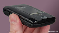
The LG Lotus is about as smart as a phone gets before we call it a smartphone, thanks mostly to Sprint's excellent new One Touch menu application. Despite its haunting resemblance to a compact makeup mirror, we even like the form factor, as it provides a nice, comfortable QWERTY keyboard and keeps a classy look. The external screen is unfortunately an afterthought, even with the dedicated music keys, and call quality could have been much better. But for dedicated messaging fans, even those with corporate e-mail to read, this phone provides an interesting alternative to the more complicated smartphone set. Plus, with access to Google Docs, a capable (though not desktop-grade) Web browser and tethered modem support, maybe this phone is even smarter than we thought. Knock $100 off the price, and we'll take two. Release: October 2008. Price: $100.
Pros: One Touch is great looking and convenient. Keyboard is tall and comfortable. Capable Web browser. Surprisingly good (and corporate) messaging options.
Cons: Call quality isn't great. Interface could react more quickly to navigation. Camera is lousy. Phone is pricey.
Interface design - Very good
 Sprint's new One Touch menu app is a pleasure to use, and very useful, to boot. Basically, the app includes a menu bar, or "carousel," at the bottom of the screen. This carousel is made up of "tiles," each of which can access an app, provide information or jump to a specific phone setting. There is a tile for Web browsing that lets you jump right to the address bar or your bookmarks. CNN and the Weather Channel each get a tile, as do the Sprint Music player and Sprint Navigation.
Tiles can be moved around and edited, and the carousel can hold up to 15 different tiles, including one tile that is simply a shortcuts menu and another that offers personalization options for the One Touch app. The One Touch can be a bit sluggish, and if you load up your home screen with the full complement of tiles it can be a pain to get from one side of the list to the other. However, the entire system is very good looking and offers more customization and convenience than you'll find on any other carrier's phones. While AT&T and verizon Wireless are still trying to get their 5-year old icon menus to fit onto today's phones, Sprint is offering something new and smart.
Calling - Good
The LG Lotus had some nice calling options, helped along by some of the advanced features inherent in the One Touch app, but ultimately we were disappointed with the sound and call quality. On our end, calls sounded a bit distant, even with the volume cranked up to maximum. Callers reported a somewhat tinny sound, with static during calls, especially in the pauses between words. Sprint claims about 5.5 hours of talk time, and we got about that in our calling tests. Reception was strange, but not in a bad way. Actually, we found the LG Lotus roaming a bit more than we expected, but it still held onto 3-4 bars, even when those bars weren't coming from a Sprint cell tower.
Camera - Mediocre:
Pros: One Touch is great looking and convenient. Keyboard is tall and comfortable. Capable Web browser. Surprisingly good (and corporate) messaging options.
Cons: Call quality isn't great. Interface could react more quickly to navigation. Camera is lousy. Phone is pricey.
Interface design - Very good
 Sprint's new One Touch menu app is a pleasure to use, and very useful, to boot. Basically, the app includes a menu bar, or "carousel," at the bottom of the screen. This carousel is made up of "tiles," each of which can access an app, provide information or jump to a specific phone setting. There is a tile for Web browsing that lets you jump right to the address bar or your bookmarks. CNN and the Weather Channel each get a tile, as do the Sprint Music player and Sprint Navigation.
Tiles can be moved around and edited, and the carousel can hold up to 15 different tiles, including one tile that is simply a shortcuts menu and another that offers personalization options for the One Touch app. The One Touch can be a bit sluggish, and if you load up your home screen with the full complement of tiles it can be a pain to get from one side of the list to the other. However, the entire system is very good looking and offers more customization and convenience than you'll find on any other carrier's phones. While AT&T and verizon Wireless are still trying to get their 5-year old icon menus to fit onto today's phones, Sprint is offering something new and smart.
Calling - Good
The LG Lotus had some nice calling options, helped along by some of the advanced features inherent in the One Touch app, but ultimately we were disappointed with the sound and call quality. On our end, calls sounded a bit distant, even with the volume cranked up to maximum. Callers reported a somewhat tinny sound, with static during calls, especially in the pauses between words. Sprint claims about 5.5 hours of talk time, and we got about that in our calling tests. Reception was strange, but not in a bad way. Actually, we found the LG Lotus roaming a bit more than we expected, but it still held onto 3-4 bars, even when those bars weren't coming from a Sprint cell tower.
Camera - Mediocre:
The camera on the LG Lotus was unimpressive; standard cameraphone fare. The 2-megapixel shooter is poorly placed, too, on the lip of the external flap. This made self portraits difficult to line up, as the camera didn't use the external screen as a viewfinder. We'd like to see a lot of improvements, including auto focus, a self portrait mirror and perhaps an LED lamp, for starters. Photo management was fairly good, with plenty of messaging options for pictures as well as some presets for uploading pics to sharing and buying sites.


No comments:
Post a Comment